Moving more northerly from our previous edition that centered around the SEC, we arrive at the conference that thinks it is the best in everything, regardless of sport, year, or record.
The Big 12 has 10 member schools, which is exactly the math you would expect to be taught in a university like West Virginia— way to represent your brand, Mountaineers.
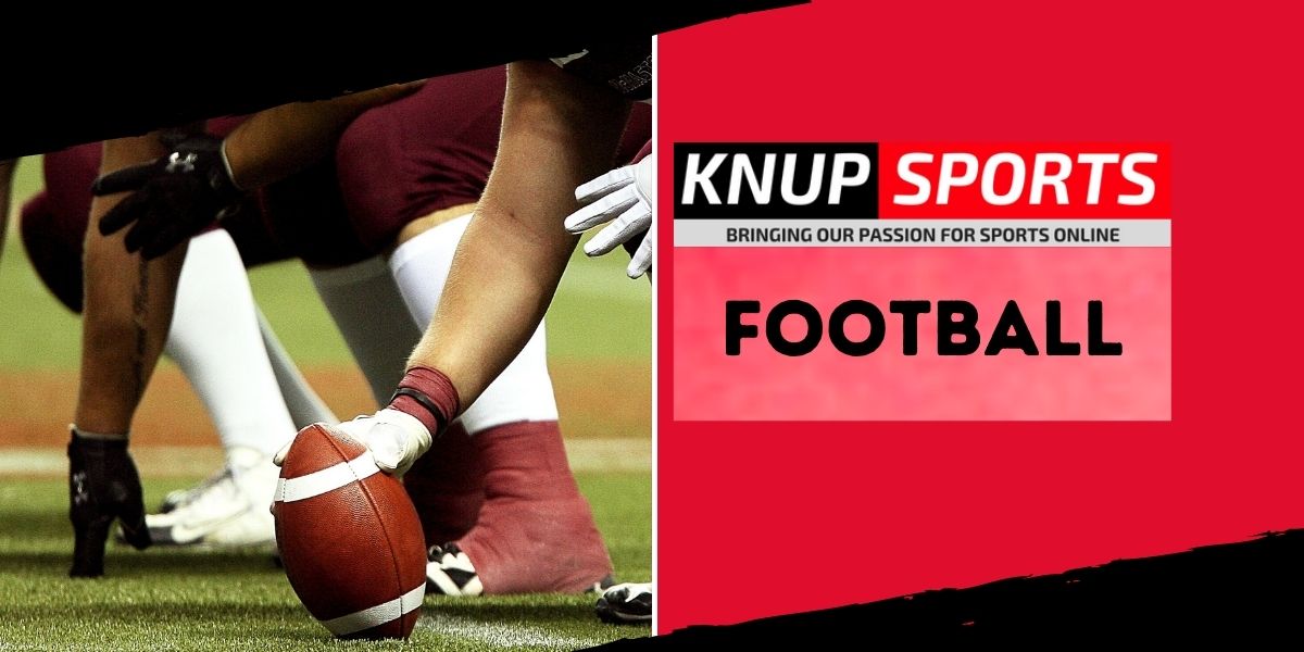
Ranking the Jerseys of College Football: Big 12 Edition
All jokes aside, the Big 12s jerseys are much easier on the eye than some of the abhorrent designs we saw down south. There can only be one winner, however, and they are listed below.
#10 Iowa State
Iowa State would fit in perfectly with Joey Chestnut and the other people at a hot dog eating contest, but on a football field they are an eyesore— I am going to assume the graphic designer had a cookout they had to attend that day and had a Freudian slip which caused them to produce a walking pile of ketchup and mustard.
Looking at this picture makes me think less of Cyclones and more of condiments because what even is this? An entry for the least intimidating jersey that ended up in the wrong hands?
As if the uniform could not be worse, the black helmets do not match at all and just look like the team could not afford to upgrade their equipment.
ISU’s best uniform is a blackout special, and its two primary colors are not black. Just think about that. 2/10.
#9 Kansas
Oh boy, here we go again. Ship Kansas down to the SEC because this blue and red trim would fit in perfectly with all of the other schools terrified of deviating from uninspiring outfits.
The Jayhawks are 7-98 over the past 12 seasons, but at least their terrible on-field dress matches their horrible play.
If the answer is to wear gray pants, the question is incorrect: maybe the Athletic Department should consider that next time they wonder why so many players transfer to play elsewhere.
Let us leave Kansas here and never speak of their jerseys or team again, at least until they manage to win two games in a season again.
Kansas gets a 2/10 but receives an honorary -100 for their recent record.
#8 Kansas State
There are just so many better ways to rock purple and silver than what K-State came up with.
These uniforms look like the best in America when glossed up and put under the perfect lighting but are relatively garbage when worn on the field, though their basketball uniforms are pretty cool.
Kansas State wins the in-state rivalry for best jersey but not by much, kind of like comparing a knockout to a TKO— one might be a smidge better than the other, but not really.
Kansas State gets a 2.01/10, purely to take the edge over Kansas.
#7 Oklahoma
Alright, Oklahoma’s uniforms are not bad, although they are far from inspiring.
The crimson and white has a classic feel to it and looks rather pristine when caught in the right light, but it is not as impressive as many other schools. Again, it appears as if a team has fallen victim to the SEC standard of red or blue and white being the only options available for their jersey.
The Sooners will be rejoicing that the College Football Playoff has been expanded to 12 teams, but they will not much up these rankings until much later when they decide to dawn a new uniform.
Short and simple, just like the jersey: 4/10.
#6 Texas
To be honest, there is not much separating Oklahoma and Texas other than the amount of
yellow that was mixed into the primary color.
I like the contrast between the orange and white better than OU’s crimson and white and enjoy the Longhorn on the helmet, whereas the Sooners do not have a mascot on their helmet.
That is about all I have to offer here. Another 4/10, this time for the Texans.
#5 Baylor
I go back and forth deciding whether I like Baylor or Notre Dame’s utilization of the gold better, but if pressed I would have to give the edge to Baylor.
The Bears have a decent look to them, although I’m not sure how much fun it would be to dress in green and gold every weekend as a fan. That aside, Baylor has a clean blackout look and a subpar whiteout, while their standard uniform is, well, standard.
This jersey is a clear tier above the ones below, but it does not belong near the top. Baylor takes home a 5/10 for this design.
#4 West Virginia
West Virginia is smack dab in the middle of “eh” and “wow, that is good.”
The Mountaineers have a less popular scheme of blue and yellow and wear it well. I am not sure why, but their jerseys look like how I imagine West Virginia should look.
I would like to see some patterns added to the jerseys, but all in all, I cannot complain.
WVU gets a 6/10 for their efforts on these uniforms.
#3 Texas Tech
Here we go, this is where it gets good: Texas Tech rocks the red with black to juxtapose the classic white and give the feeling that there is an evil sort of imposition getting ready to take place.
I like these jerseys a lot, and think they are in a separate class from everything that has been shown before. The Red Raiders’ unis look like football under stadium lights on a late Saturday night.
Well done, Texas Tech— Patrick Mahomes may have left, but a 7/10 gets you the spot for third-best jerseys in the conference.
#2 Oklahoma State
What can I say other than this should be the standard, America.
Oklahoma State has a wonderful contrast between their brilliant shade of orange and white, fits the colors with trims of black throughout, and has a great mascot slapped right onto the side of the helmet. If that was not enough for some reason, the “Cowboys” emblazoned on the pants is the perfect inspiration of creativity that everyone in charge of their school’s jerseys should strive to meet.
The Cowboys may not be the best in the league, but they just might look the best. Thank you for giving us the gift of beauty, OK State. 9/10 is the lowest that you can go here.
#1 Texas Christian University
Off of the top of your head, name me three jerseys in America that look better than this. Go on, I will wait.
The Horned Frogs are outfitted with a beautiful color combination and varying designs that attract the eye and inspire fear into their opponents.
Texas Christian produces great teams more often than not and is among the nation’s elite in jersey design, giving them a lethal combination of skill and appeal. Seriously, any athletes out there, imagine yourself wearing this and get back to me.
TCU is now the first recipient of a perfect 10/10 in this series, and they will undoubtedly be featured in the “Championship Edition” of the best jerseys from the major conferences— I still cannot get over how beautiful these are.
Any arguments?
Grant Mitchell is a sportswriter and multimedia contributor for the Sports 2.0 Network dealing with basketball, football, soccer, and other major sports: you can connect with him on Twitter @milemitchell to stay up to date with the latest sports news and to engage personally with him.